“One of the first things you have to decide on with a musical is why should there be songs.”
The person speaking is Stephen Sondheim, the writer of some of the best songs for musicals in the 20th century, who died in November aged 91.
You can put songs in any story, but what I think you have to look for is, why are songs necessary to this story? If it’s unnecessary, then the show generally turns out to be not very good.
I’m no Sondheim, but as an editor I won’t put a graph into any story unless it is absolutely necessary to tell the story.
When I do, the picture can be worth at least the 800 words that accompany it.
So here are my 10 favourites from the business and economy stories I edited for The Conversation in 2021.
Some of the best graphs remove doubt
This graph, from the Bureau of Statistics, leaves no doubt about what happens to consumer spending when lockdowns end.
Released in November, with the national accounts, it uses bank account data to show what happened to spending on clothes, furnishings, recreation, transport and restaurants and hotels.
Selected Victorian spending data
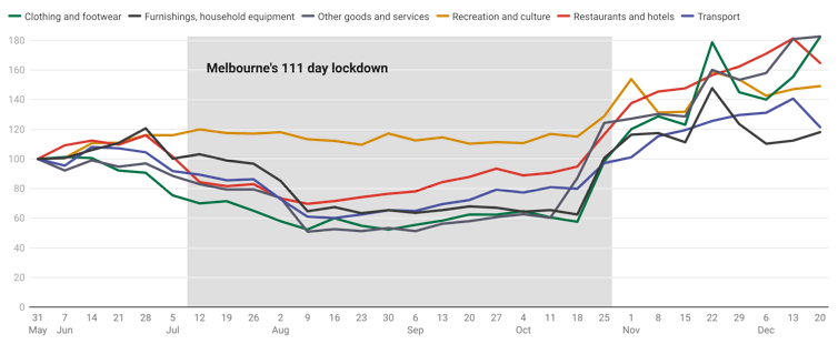
While the effect is clear, and beautifully illustrated, it can be interpreted in two ways. One is that lockdowns are to be avoided because they suppress ordinary life.
The other is that Victoria’s long lockdown was caused by the failure of the NSW government to lockdown quickly enough and hard enough as the Delta variant spread, meaning lockdowns are to be embraced, and quickly.
Another graph that removed doubt is this one showing what Australia’s July 2012 to July 2014 carbon price did to greenhouse gas emissions, excluding those related to land use and forestry that are subject to government directives.
Australian emissions excluding land use, land-use change and forestry
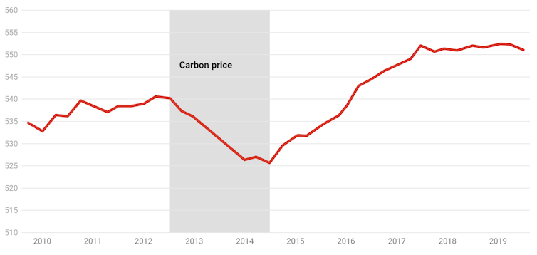
Whatever else is said about the carbon price, its effect on emissions is clear.
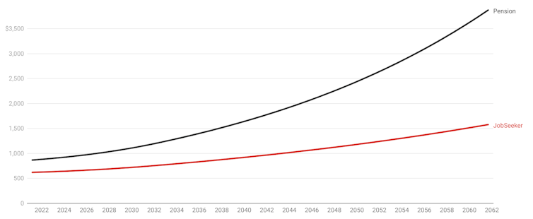
Also clear, and enormous when you look at it, is what our current system of adjusting JobSeeker only in line with the consumer price index will do to it compared to the age pension, which is adjusted in line with wages.
The projections in this graph derive from the mid-year intergenerational report which looks forward 40 years.
After 40 years – unless there’s an extra increase, and one wasn’t allowed for in the intergenerational report – JobSeeker will be a mere fraction of the pension.
JobSeeker and age pension as projected in intergenerational report
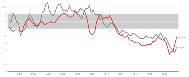
Also shrinking, with unfortunate consequences for Australians with mortgages and Australians trying to get them, has been wage growth.
The government has been forecasting a return to the 3-4% wage growth we once had in every budget since 2012, save for the last two.
Right now public sector wages growth, which used to lead private sector growth, is well below 2%. Private sector growth has started to climb, but it is well short of where it was.
Wage price index
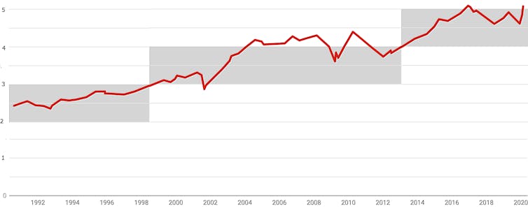
Up until the year 2000, buying a home cost between two and three times household after tax-income.
Then, after the headline rate of capital gains tax was halved and investors dived into the market, prices climbed to between three and four times income.
Six years ago they jumped again to between four and five times income, and in 2021 they climbed once again to more than six times disposable income.
Home prices as a proportion of household disposable income
While low wage growth should make it harder to pay off a loan than it used to be, just at the moment ultra-low interest rates are making it easier to service mortgages than it has been in decades.
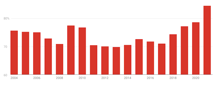
But what the Reserve Bank calls housing accessibility (to distinguish it from housing affordability) is much worse.
Astounding price growth and a decade of weak wages growth have pushed up the cost of an average first home deposit from 70% of income to more than 80%.
Average first home buyer deposit
Other graphs surprise
If we start building more houses, it stands to reason that we will get more houses.
That’ll doubtless be the case eventually, but if you are expecting it to happen any time soon, you will be disappointed.
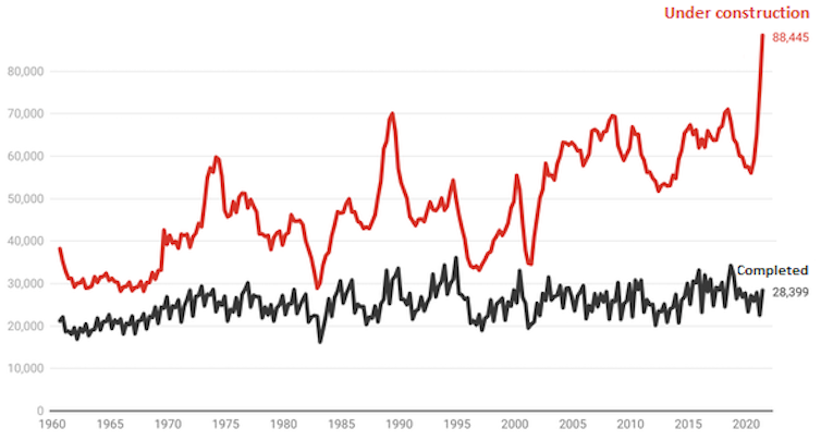
In the space of a year, the number of Australian houses (not apartments) under construction has jumped from 56,060 to 88,445 — the most ever.
But bizarrely, as has been the case for half a century, the number of houses completed each quarter has barely moved.
It’s as if home building can’t scale up.
Houses under construction, houses completed, quarterly
Another surprising graph shows the disconnect between crime and our desire to lock people up.
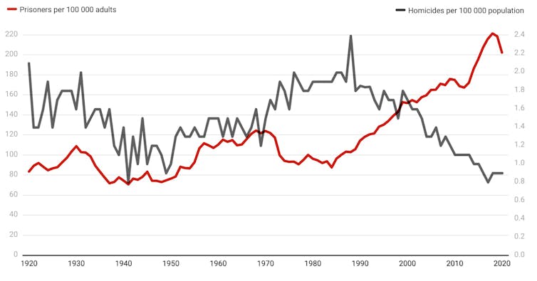
Nonviolent crime has plummeted. Between 2000 and 2020, armed robberies fell from 9,480 to 4,746, unarmed robberies fell from 13,850 to 4,666, and motor vehicle vehicle theft fell from 138,915 to 48,056.
Violent crime is falling too. The Productivity Commission believes homicide gives the best read on crime because almost all homicides are reported.
It found that while homicide has plummeted, imprisonment has doubled.
Homicides and imprisonment per 100,000 Australians
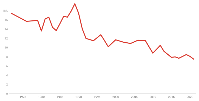
Another surprise is that the “great resignation” – the jump in the proportion of workers quitting their jobs in the United States – hasn’t been seen here.
It seems to be a real phenomenon in the US, where low vaccination rates have made public-facing jobs dangerous, but not here where resignations have been falling for decades.
Australians seem increasingly resigned to staying in the jobs they are in.
The proportion of Australians who changed jobs in the past year
The very best graphs tell an entire story
When COVID took off in the first half of 2020 there was concern that many more people would die as a result of COVID than were recorded as COVID deaths.
Some of these “excess deaths” would be COVID deaths that were not classified as COVID; some would be extra deaths caused by measures such as lockdowns; and some would be caused by crowded medical facilities turning away patients.
Worldwide, there have been millions of excess deaths.
But not in Australia. In several months Australia’s excess deaths have been negative, with more deaths avoided than usual, in part because better health practices prevented deaths from the flu.
To track excess deaths the Bureau of Statistics has graphed the number of doctor certified deaths actually recorded each week against the number that would be expected for that week given the average over the past five years.
Weekly deaths vs 2015-2019 average
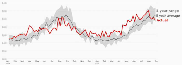
What is apparent is that in most weeks Australian deaths have been little more than would be expected given five-year averages and in many weeks less.
If COVID has been killing people in ways we can’t see, the effect has been offset by the measures we have taken to combat COVID – saving lives in other ways we can’t see.
It’s an important finding, not at all foreseeable, and illustrated beautifully.
Peter Martin, is a visiting Fellow at the Crawford School of Public Policy, Australian National University
This article is republished from The Conversation under a Creative Commons license. Read the original article.

